Cryptograd
Cryptograd
Simplifying the complex cryptocurrency experience
Simplifying the complex cryptocurrency experience
Product Design
UX-UI Design
Design System

Project Overview
Project Overview
A space where beginners could easily learn about cryptocurrency and where experienced traders could find advanced tools to help them make better decisions.
A space where beginners could easily learn about cryptocurrency and where experienced traders could find advanced tools to help them make better decisions.
My Role
Product Design
Product Strategy
UX Design
UI Design
Team
Soumya
(co-designer)
Tools
Figma
FigJam
Miro
Notion
Timeline
7-8 Months
Problem - Solution
Problem - Solution
How can we create an intuitive and engaging journey that empowers users of all crypto knowledge levels to confidently use the platform?
How can we create an intuitive and engaging journey that empowers users of all crypto knowledge levels to confidently use the platform?
A platform that serves as both an educational guide and a trading companion:
Simplified one stop solution
Guided Educational Pathways
Personalized learning
A platform that serves as both an educational guide and a trading companion:
Simplified one stop solution
Guided Educational Pathways
Personalized learning
Understanding the Market
Understanding the Market
Volatility and complexity of the crypto market makes the users feel chaotic and confused
Volatility and complexity of the crypto market makes the users feel chaotic and confused
01
People wanted to get into crypto, but they hit a wall of confusion
People wanted to get into crypto, but they hit a wall of confusion
02
Users were trying to piece together reliable advice from scattered resources
Users were trying to piece together reliable advice from scattered resources
03
Crypto moves fast. By the time you read something about it might’ve changed
Crypto moves fast. By the time you read something about it might’ve changed
Competitive Analysis
Competitive Analysis
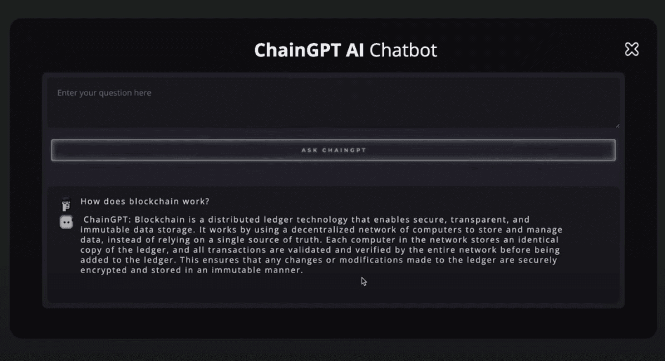


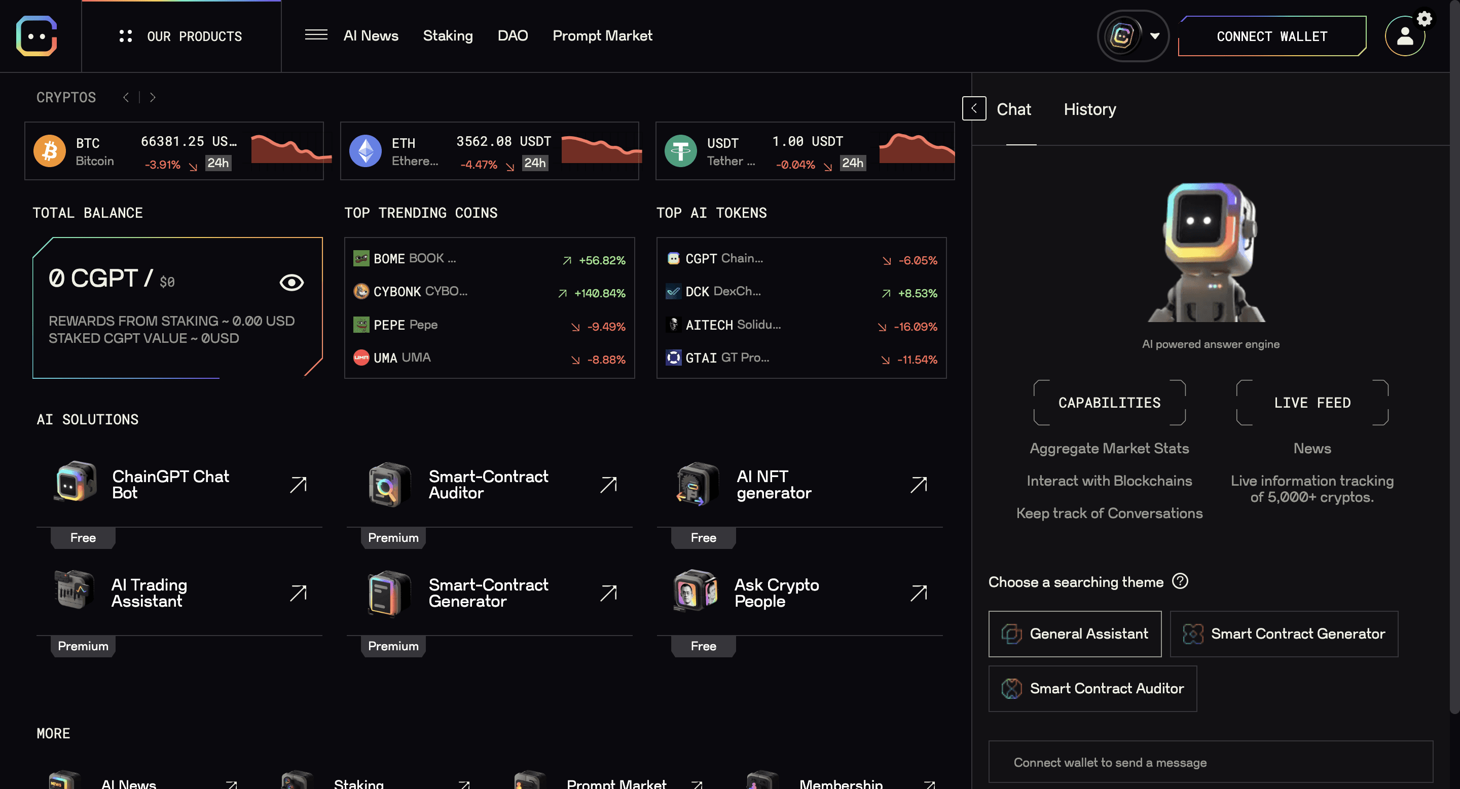


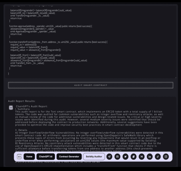


Pros
Pros
AI powered explanation and answers for educational use
Simple and clean dashboard with easy to access information
AI powered explanation and answers for educational use
Simple and clean dashboard with easy to access information
Cons
Cons
Cluttered interface with overload of informationan
Most of the competitors lack personalised AI assistance
Cluttered interface with overload of informationan
Most of the competitors lack personalised AI assistance
Understanding the Users
Understanding the Users
The cryptocurrency journey starts with excitement and ends up in a lot of confusion
The cryptocurrency journey starts with excitement and ends up in a lot of confusion
Target Users
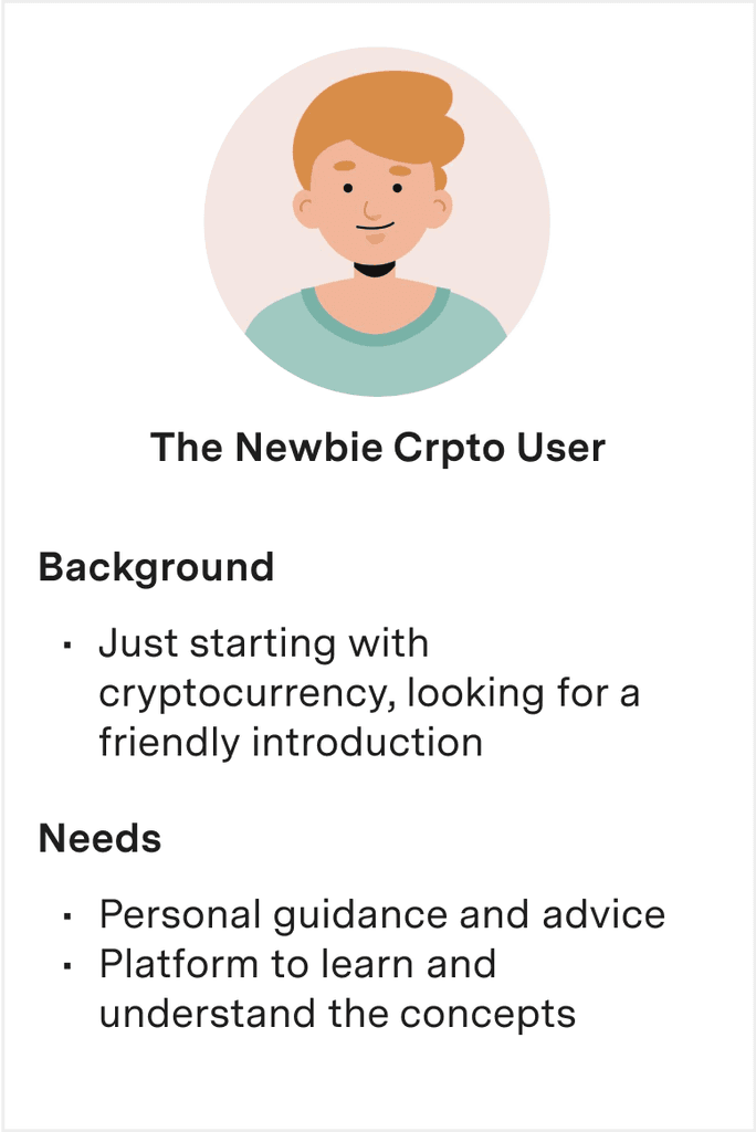


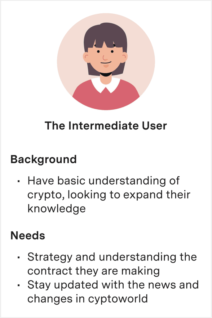


User Research
User Research
Research Methods:
Research Methods:
Guerrilla, stakeholder interview and user interviews
Guerrilla, stakeholder interview and user interviews
Our research confirmed our findings and clarified our design direction. Users want a platform that simplifies crypto into clear, manageable segments and provides an informative, easy-to-navigate guide through the crypto landscape
Our research confirmed our findings and clarified our design direction. Users want a platform that simplifies crypto into clear, manageable segments and provides an informative, easy-to-navigate guide through the crypto landscape
Observations
Frustration with using multiple platforms for trading and learning
Generic news feed contains overload of irrelevant information
Breaking down concepts into easily understandable segments
Insights
Need for creating a centralised hub
The design should be simple and navigable
Users need guided educational pathways
Reducing crypto complexity is a priority
Ideating Solutions
Ideating Solutions
We aimed to develop solutions that help users grasp the process and feel guided beyond the initial onboarding and the overall experience is mobile friendly
We aimed to develop solutions that help users grasp the process and feel guided beyond the initial onboarding and the overall experience is mobile friendly
User Journey Map
User Journey Map


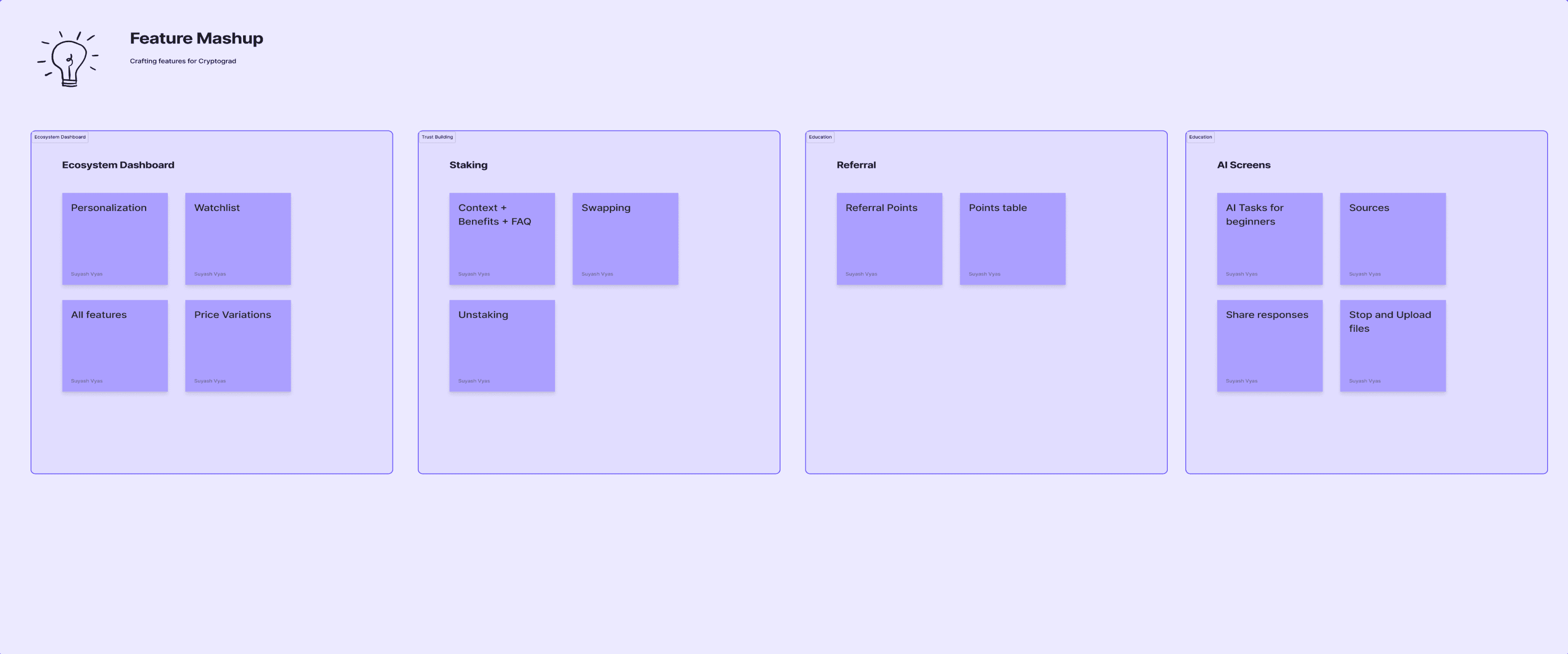
Brainstorming Features
Brainstorming Features
We aimed to streamline the trading experience for our users by exploring solutions that enhance understanding of the cryptocurrency world and equip them with the necessary tools to excel in crypto trading.
We aimed to streamline the trading experience for our users by exploring solutions that enhance understanding of the cryptocurrency world and equip them with the necessary tools to excel in crypto trading.


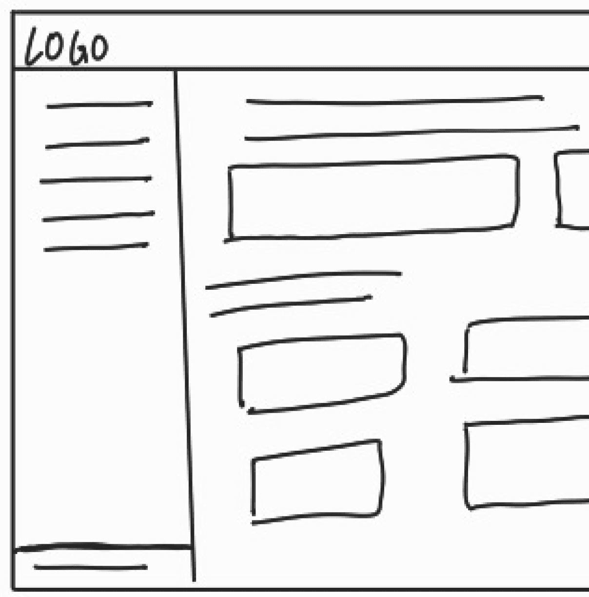
Wireframes
Wireframes
From hand drawn wireframes to digital wireframes
From hand drawn wireframes to digital wireframes


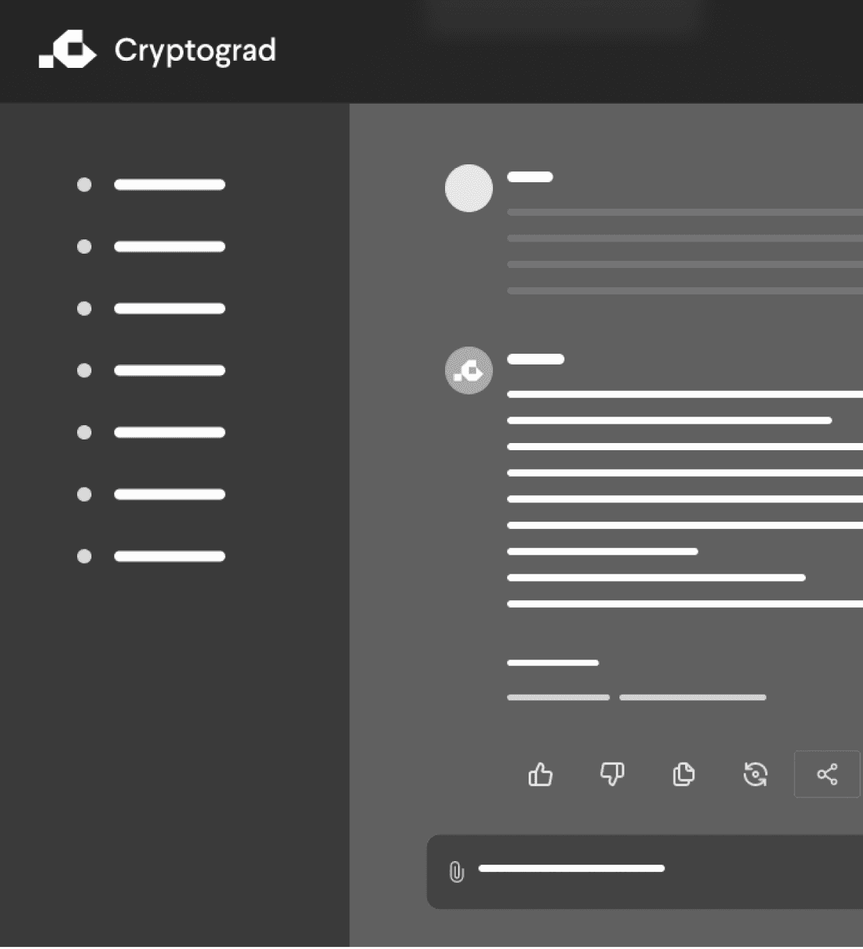




Crafting the final product
Crafting the final product
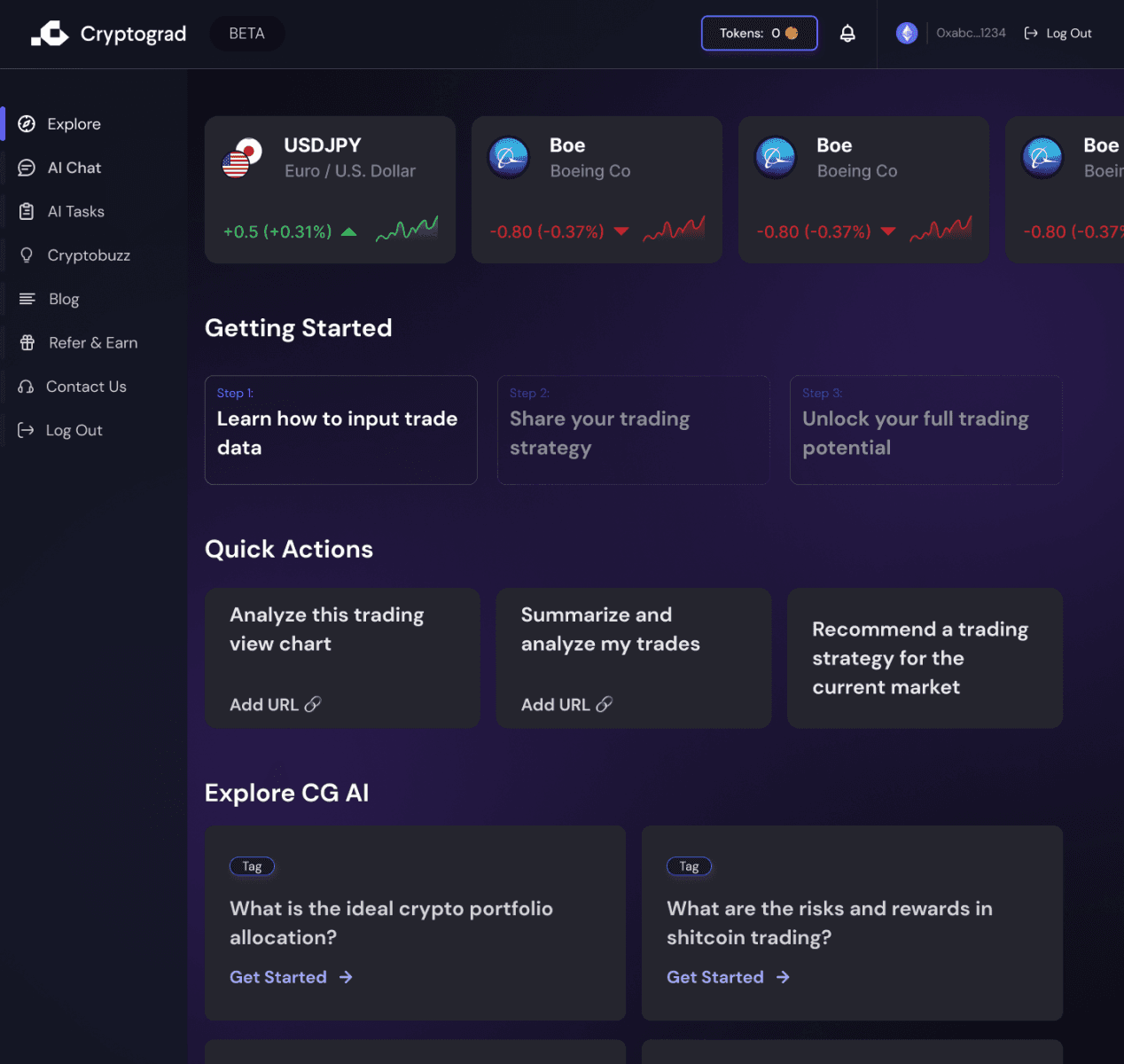
Usability Testing
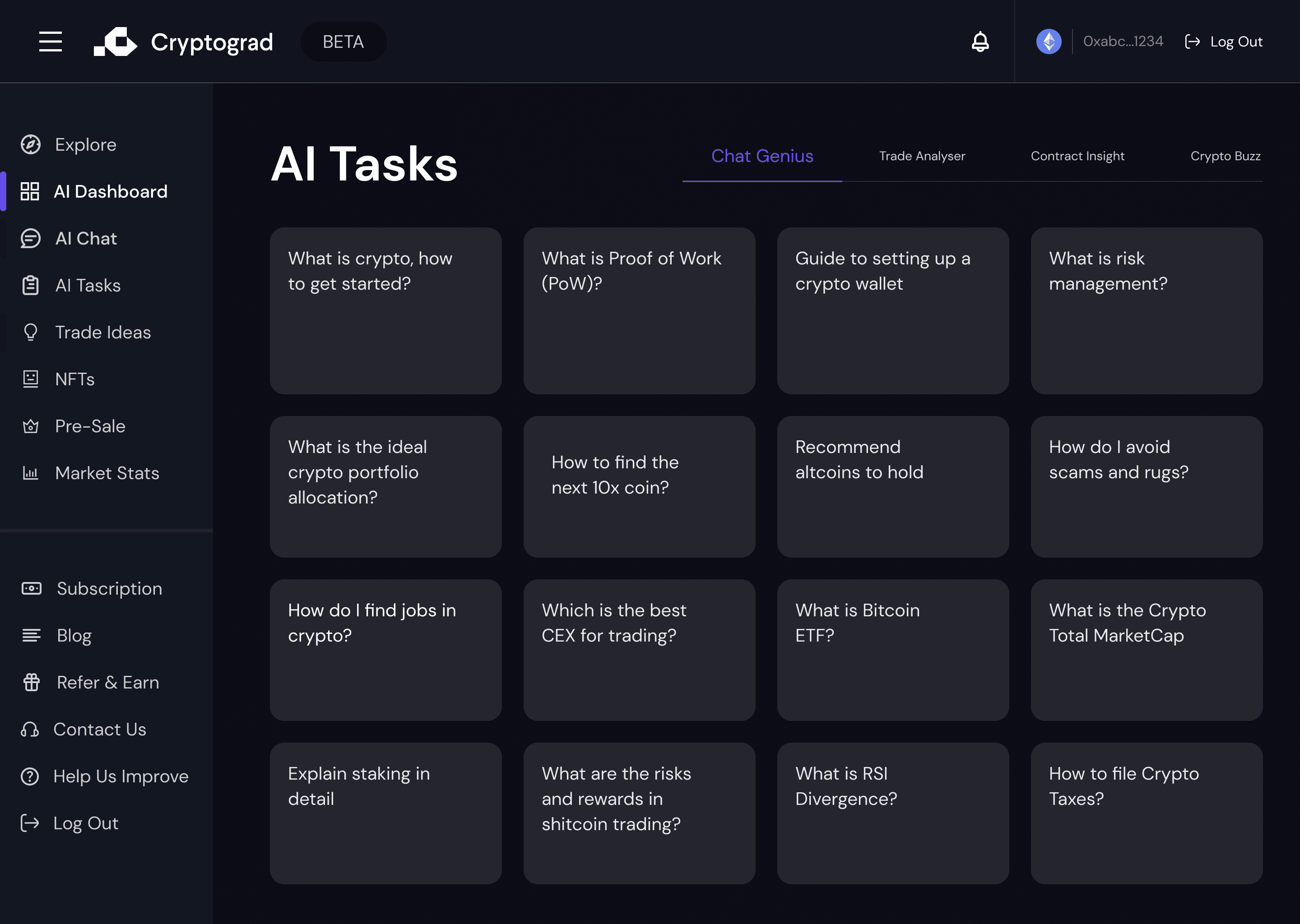
Before
We designed the layout which was made to be intuitive for the users organizing content into clearly defined areas. Structure seemed logical and intuitive for the intermediate and pro level user but novice faced some issues to understand.
After
Post test we discovered that users found a more streamlined navigation system easier to use, which led to a restructuring of menu items and paths. More features like clear CTA, customization watchlist options were given to make it more intuitive.

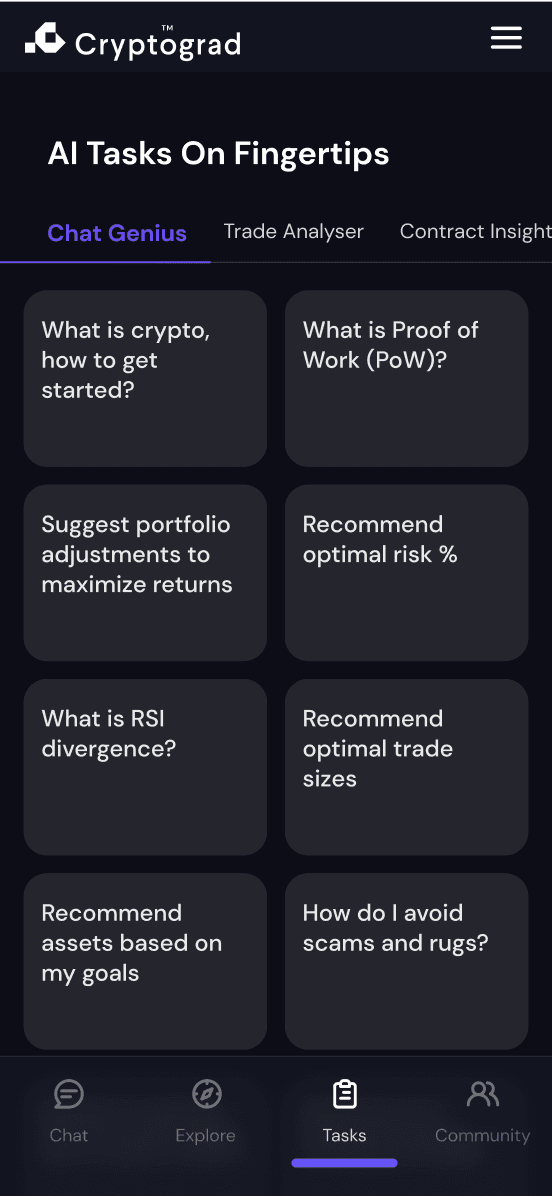

Before
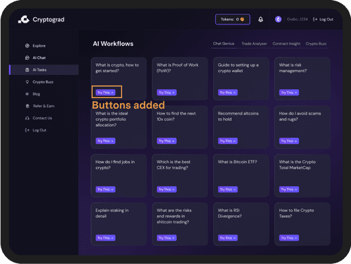

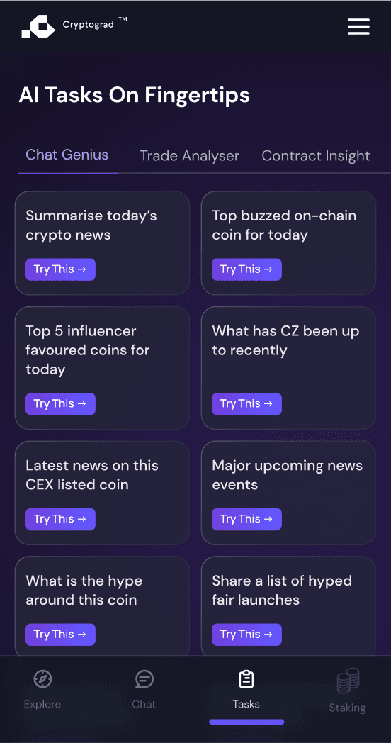

After


Before
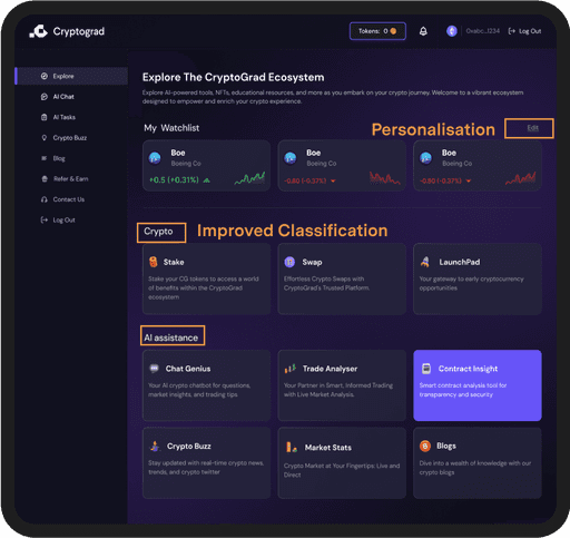

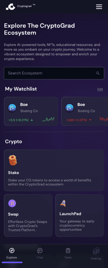

After
UI Elements
UI Elements
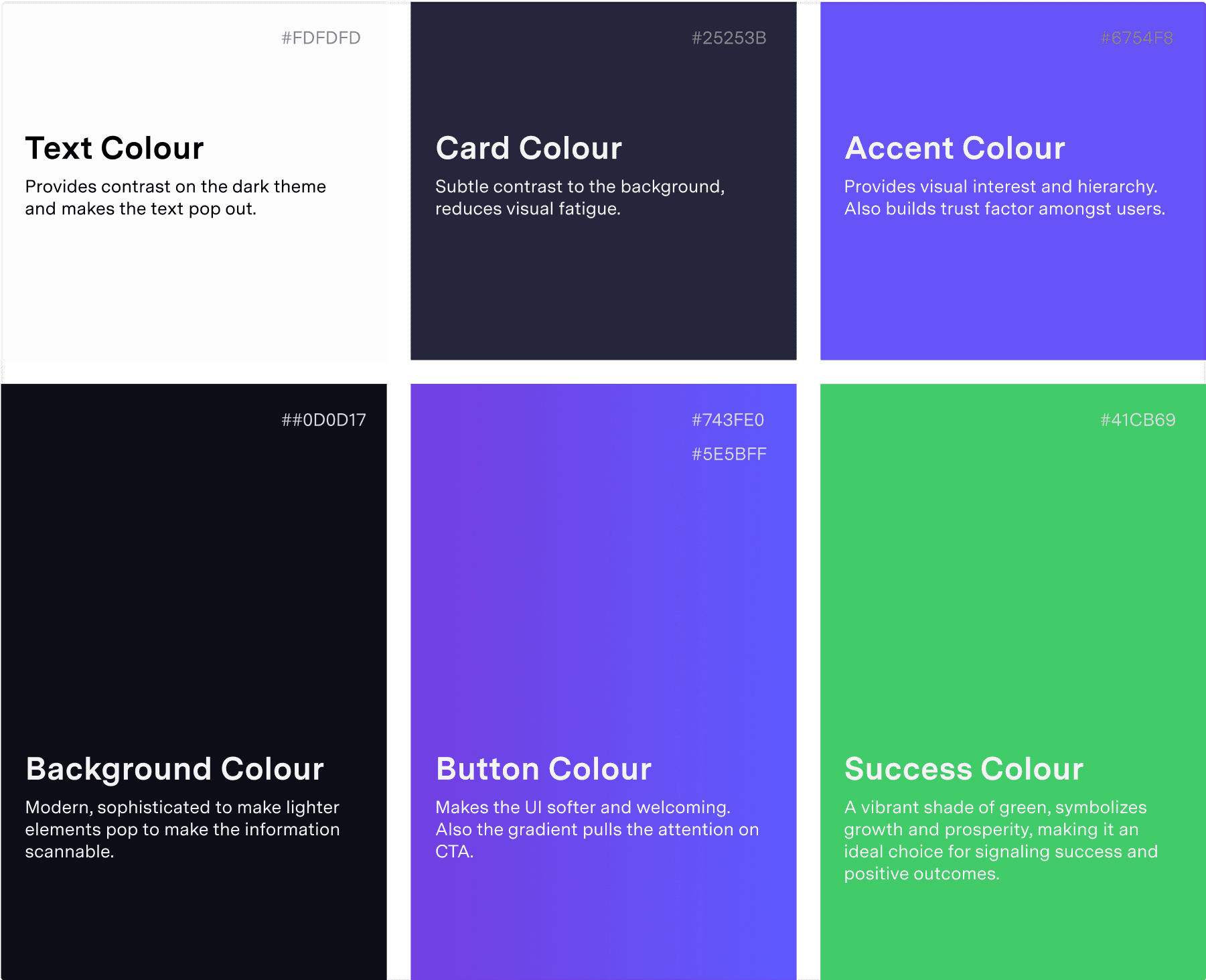
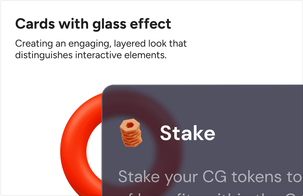
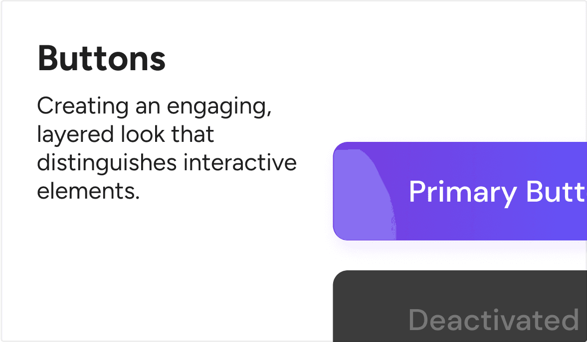
The visuals are designed to be friendly, welcoming, and intriguing, offering a simplistic experience that reduces cognitive load for users
The visuals are designed to be friendly, welcoming, and intriguing, offering a simplistic experience that reduces cognitive load for users





Features
Features
Every feature is crafted to simplify use and enhance intuitiveness, maintaining functionality without complexity
Every feature is crafted to simplify use and enhance intuitiveness, maintaining functionality without complexity


Ecosystem Dashboard
Ecosystem Dashboard
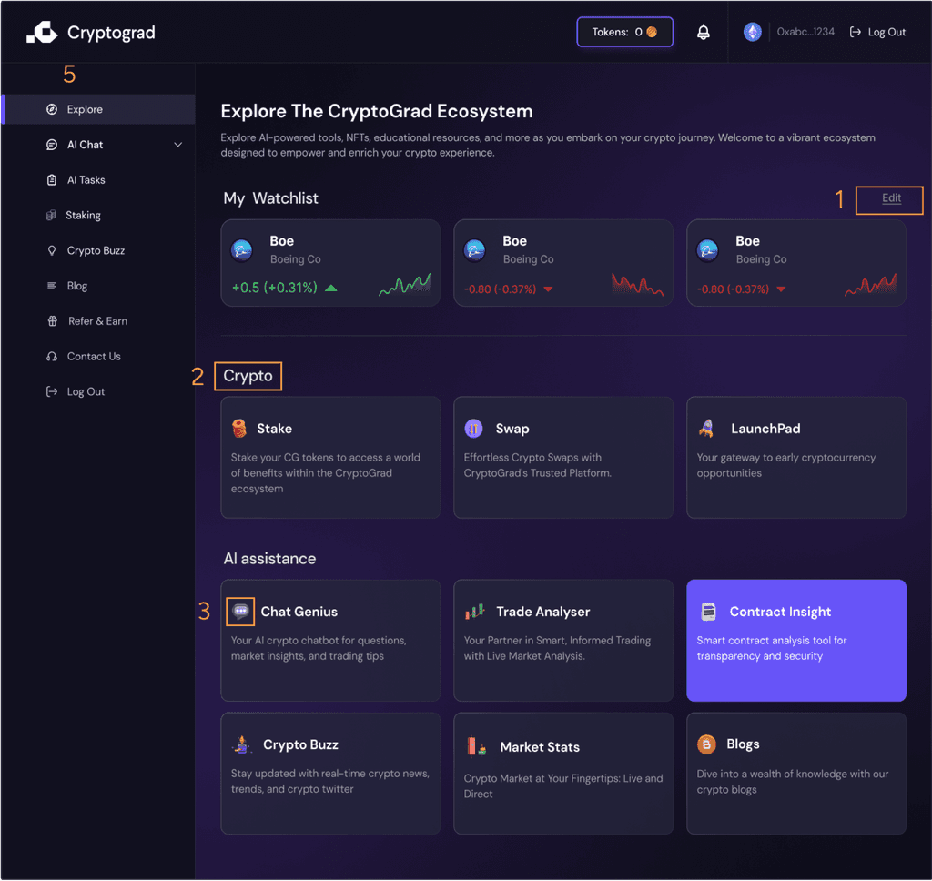
Personalisation: Option to edit the watchlist makes the dashboard more personalised and interesting to the user.
Personalisation: Option to edit the watchlist makes the dashboard more personalised and interesting to the user.
Law of Proximity: Functional grouping of related items which helps users process the information as part of a related set.
Law of Proximity: Functional grouping of related items which helps users process the information as part of a related set.
Iconography: Use of playful icons next to each feature quickly communicates the function making the platform friendly.
Iconography: Use of playful icons next to each feature quickly communicates the function making the platform friendly.
F reading pattern and card layout: Helps the user to scan information easily and fast.
F reading pattern and card layout: Helps the user to scan information easily and fast.
Side Navigation: Makes sure that the user doesn’t get lost in the complexity of the platform and makes it navigable.
Side Navigation: Makes sure that the user doesn’t get lost in the complexity of the platform and makes it navigable.
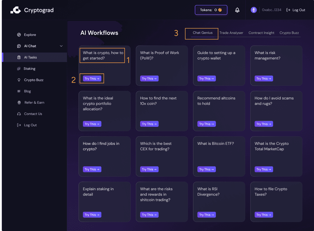


AI Workflows
AI Workflows
Progressive Disclosure: Offering a glimpse with more details just a click away, prevents information overload.
Progressive Disclosure: Offering a glimpse with more details just a click away, prevents information overload.
Guided User Journey: The page follows a scaffolding approach through various guided learning paths making learning easier.
Guided User Journey: The page follows a scaffolding approach through various guided learning paths making learning easier.
Content Categorization: into common user queries and questions makes the learning intuitive and self directed.
Content Categorization: into common user queries and questions makes the learning intuitive and self directed.
Uniform Grid Layout: Each workflow card is of same size and this consistency makes the layout comfortable and familiar.
Uniform Grid Layout: Each workflow card is of same size and this consistency makes the layout comfortable and familiar.
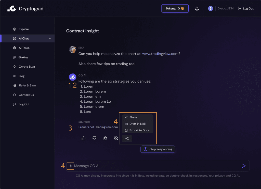


AI Chat
AI Chat
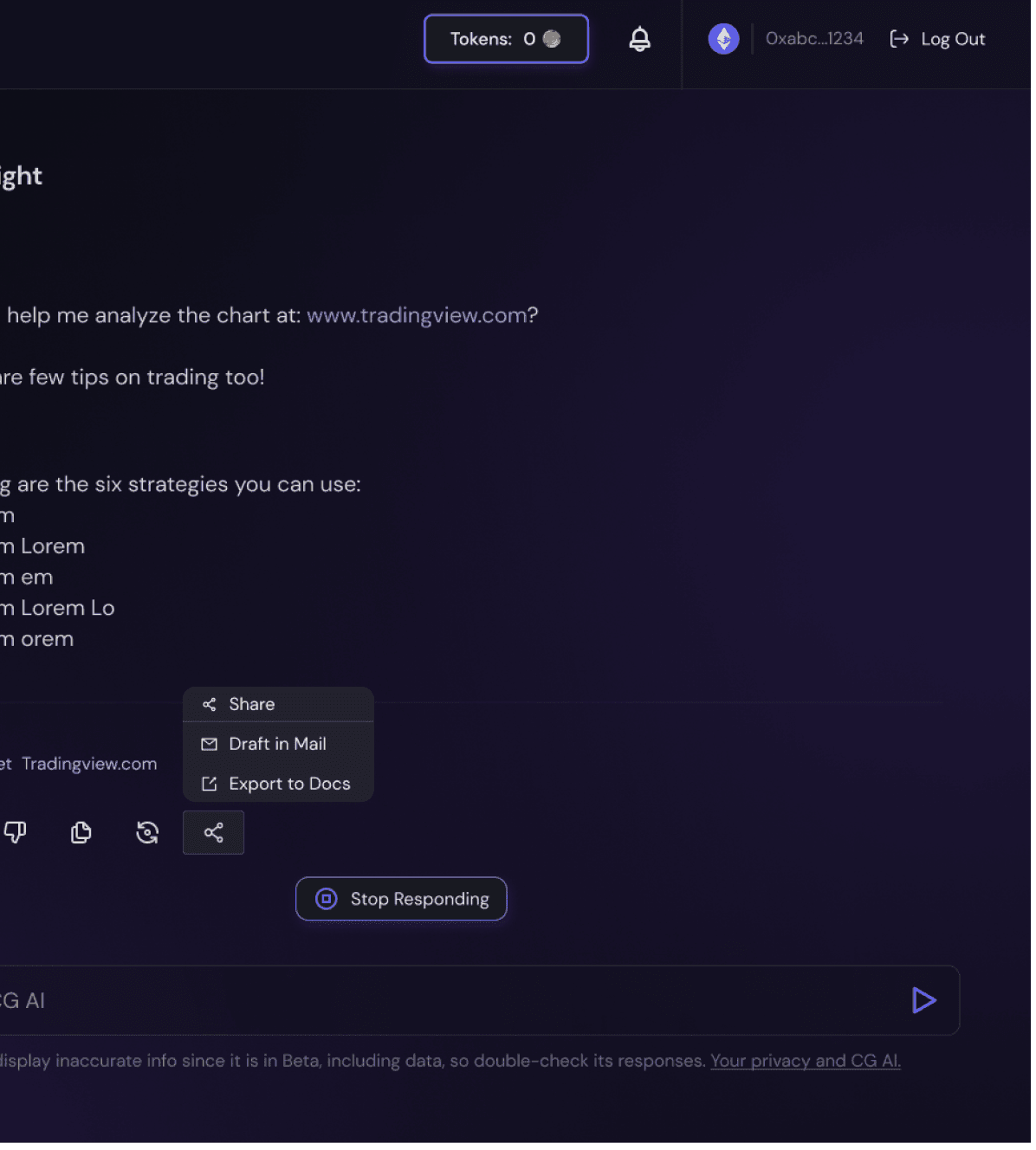
Conversational Interface: makes it intuitive and easy for the user to comprehend.
Conversational Interface: makes it intuitive and easy for the user to comprehend.
Digestible Output: Output structured in points makes it scannable and easier to understand.
Digestible Output: Output structured in points makes it scannable and easier to understand.
Showing Sources: it makes the information reliable and makes it easier for the user to refer to the sources
Showing Sources: it makes the information reliable and makes it easier for the user to refer to the sources
Clear Distinguished Buttons: makes the response interactive and makes it more functional.
Clear Distinguished Buttons: makes the response interactive and makes it more functional.
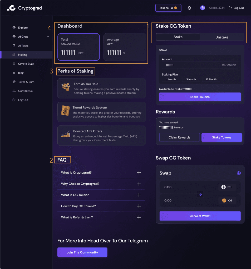


Staking Dashboard
Staking Dashboard
Simple Interface: Makes the platform easy to use and familiar highlighting key information.
Simple Interface: Makes the platform easy to use and familiar highlighting key information.
Information Tooltip: Accordion FAQ to help the users make informed decisions.
Information Tooltip: Accordion FAQ to help the users make informed decisions.
Law of Common Region: Grouping staking information and actions in same area helps users understand they are related.
Law of Common Region: Grouping staking information and actions in same area helps users understand they are related.
Catering Novice and Pros: Simplified guidance for novices and detailed metrics for pro users.
Catering Novice and Pros: Simplified guidance for novices and detailed metrics for pro users.
Final Designs
Final Designs
The final intuitive and user friendly crypto experience
The final intuitive and user friendly crypto experience
The Final Product
Cryptobuzz
AI tasks
AI tasks
Staking
Impact
Impact
Collaboration and clear communication with cross functional team led to 10,000 sign-ups in two months
Collaboration and clear communication with cross functional team led to 10,000 sign-ups in two months
Outcomes
Outcomes
The outcomes have been both tangible and transformative. Post launch 10,000 user sign up within 1-2 months and positive user feedback.
Moving forward, we will continue to harness these successes as a foundation for future innovation, ensuring user-centric design and cutting-edge functionality.
The outcomes have been both tangible and transformative. Post launch 10,000 user sign up within 1-2 months and positive user feedback.
Moving forward, we will continue to harness these successes as a foundation for future innovation, ensuring user-centric design and cutting-edge functionality.
Learnings
Learnings
During the CryptoGrad project, I learned that effective UX design is a symphony created through the harmonious collaboration of diverse minds, where each idea is a note contributing to the user's melody.
During the CryptoGrad project, I learned that effective UX design is a symphony created through the harmonious collaboration of diverse minds, where each idea is a note contributing to the user's melody.
Collaboration is the key
Collaboration is the key
Attention to Detail
Attention to Detail
User Feedback is a Lighthouse
User Feedback is a Lighthouse
Clear Communication Paves the Way
Clear Communication Paves the Way

